


So far, we can split James McDonald’s Pirate career into three acts; his strong post-trade finish to 2010, his ugly start to 2011 (his first four starts of the season), and the seven starts he’s made since then. We already know McDonald’s basic tendencies; he strikes a lot of hitters out, he throws a lot of pitches, and he gives up a lot of flyballs that can occasionally lead to homers. When he’s struggling, he walks a lot of hitters and gives up more home runs. When he’s on, the strikeouts add up quicker and the ball stays in the park a bit more. So what’s the difference between struggling McDonald and successful McDonald?
Let’s start with pitch selection. Last year after the trade, McDonald threw his fastball 65.7% of the time, his curve 20.4% of the time, and his changeup 13.9% of the time. Though his styles and pitches are very different from Charlie Morton, their approaches are similar. Pound away with the fastball and the curveball and use the changeup to keep hitters off balance. As I’ve said in the past, McDonald’s best outings last year were the ones where he was using his changeup and hitters were swinging at it and missing it.
So what happened at the beginning of 2011? If you’ll recall, I noticed pretty early on that McDonald wasn’t using his changeup as often and my theory was that he wasn’t that comfortable with it after his oblique injury in spring training. In those first four starts, McDonald used his fastball 67.6% of the time, his curve 20.7% of the time, and his changeup 9.6% of the time (the numbers don’t quite add up because of a few unclassifiable pitches, likely wild pitches). In short, more fastballs, fewer changeups. McDonald’s numbers in those four starts were brutal: he gave up five homers in 18 2/3 innings, he walked 12 and struck out 12, and his ERA was an astronomical 10.13.
Since then, things have gotten quite a bit better for McDonald. Even including his ugly start against the Brewers on May 13th, McDonald’s thrown 40 2/3 innings in his last seven starts, struck out 39, walked 14, and only allowed four homers. His ERA after tonight over the span is 2.43. He looks much, much more like the pitcher we saw last August. So what does his pitch selection look like? His fastball usage has actually increased to 70.1%, his curveball usage is steady at 20.8%, and he’s dropped his changeup usage is down even further to 9.1% (note: these don’t include last night’s start). So obviously increased changeup usage isn’t the key to McDonald’s success. What is?
Let’s look at the break graphs. I’m going to start by pasting in the horizontal break vs. vertical break graphs from Joe Lefkowitz’s PitchFX site because they have pitch classification. McDonald’s changeup and fastball can be hard to separate without a reference point, so keep these three graphs in mind as the post progresses. They’re for the three periods of time discussed above; after August 1st last year, his first four starts in 2011, and his six starts since then (last night’s start against the Mets hasn’t been posted as of this writing). Make sure to note that the legend changes between the first chart and the next two. 

 The biggest difference that’s immediately obvious is year is that a bunch of McDonald’s fastballs are being classified as two-seamers. To be perfectly honest, though, I don’t see a huge difference between the fastballs this year and last year (you can see a bunch of them behind the changeup, which is what are showing up as two-seamers this year). There’s not much of a velocity difference, either, so I don’t want to jump to the conclusion that his two-seamer is what’s different between this year and last year.
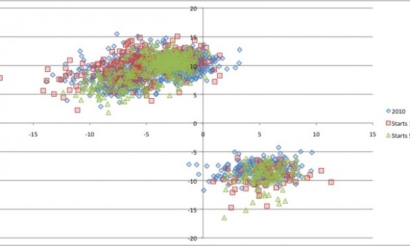
Let’s take the numbers from those three graphs and overlay them (again, no numbers from last night) to see if any differences stand out.
 This is a pretty basic analysis here, but there’s not a whole lot that we can learn from these charts. When overlayed, his pitches look mostly the same from last year to early this year to his current strong run in 2011. You could argue that the green (his most current starts) is grouped a little more tightly and that’s proof that he’s been more consistent, but that’s a tough conclusion to draw.
The next question to ask is how his fastballs and changeups have varied over the last year. I think it’s pretty safe to say that his curveball isn’t changing, but since the fastball and change get lumped together they’re harder to analyze on a chart like this. That’s where tomorrow’s post is headed, along with a look at how McDonald is using his pitches at various points in the game.